NSPA 2023 Designer of the Year Selected Work
A week before school started my freshman year I designed my first page at our publication’s design bootcamp. I made an adobe account, and then I found a page I wanted to mimic. After I finished the replica page on InDesign, I was done and went home. But when I got home I opened up InDesign, mimicked more pages, learned more tools and more ways to use InDesign. Now as a graduated senior, I am leaving my staff after two years as a Print Editor-in-Chief.
I have helped brainstorm pages from the very beginning, rerouted pages halfway through and helped with the last missing pieces. From start to finish when designing, it’s important to have a vision for each page/spread, and this vision should fit within the broader vision of the whole edition and publication.
I have learned a lot from being an editor and keeping designs cohesive, but still original. When designing throughout all sections of the newsmagazine, you have to keep in mind the feel of that section and the feel of the entire publication. To keep everything cohesive, elements of design are very important. I have developed my skills using photography, lines, color, typography, white-space and graphics, and I have been able to create new concepts in my designs.
My biggest takeaway from becoming a journalist for the past four years is that everybody has a story, and as a journalist it is a gift to tell it. There is a new type of responsibility you learn in journalism: how to tell true stories and when or when not to tell a story. Designing is one step of this process to tell stories the best you can. Each story and each page deserves your time, energy and efforts.
I lose time when I am working on design. As a leader in the classroom, I suggest our staff to explore as many areas of journalism as possible, and when they find something they lose time doing I encourage them to dive in. When designing, I have learned and been inspired by the editors before me. This year and last, I learned and pushed myself to give a page time: to not stop at a handful of drafts when something feels off, and to go through close to 100 to get the perfect spread.
This year, I have taught my co-editors and staff how to be obnoxiously picky when it comes to design, particularly alignments. Everything on the pages are aligned following our 2023 Alignment Guide. As the end of the year came, I taught next years Print Editors-in-Chief how to put together a 100+ page magazine. This year, our second edition was 148 pages. Going through 148 pages after it is all put into a master, seemingly done, takes longer than creating those 148 pages. Before sending to print there is lots to do in the final stage: spell checks, alignments, proofing, byline and photography credit checks, strengthening designs, linking images, and more. This is behind the scenes work that I did this year as the last edits before sending each edition to print, and that I tried to teach next years editors by running them through some of these steps and bringing in old paper copy edits.
From coming into journalism shy and extremely intimidated freshman year to graduating as a Print Editor-in-Chief for two years, I have grown as a person and found design, which has become something I love and plan to continue learning in college.
-
National Scholastic Press Association:
Print Pacemaker, 2022
Pacemaker Winner, The Communicator Magazine
Best of Show, Fall 2022
Fourth Place, The Communicator Magazine
Best of Show, Fall 2021
Seventh Place, The Communicator Magazine
Best of Show, Spring 2022
First Place, The Communicator Magazine
Columbia Scholastic Press Association:
2022-2023
Silver Crown Winner, High School Hybrid News: The Communicator
Crown Finalist, High School Hybrid News: The Communicator
2021-2022
Gold Crown Winner, High School Hybrid News: The Communicator
Crown Finalist, High School Hybrid News: The Communicator
Michigan Interscholastic Press Association:
2022-2023
Spartan Award: “The Communicator Magazine”
2021-2022
Spartan Award: “The Communicator Magazine”
-
NSPA
Design of the Year, Fall 2022
Honorable Mention, Newsmagazine Page/Spread, Story Package: “Bloom”
Clips and Clicks, Spring 2022
Second Place, Magazine Page/Spread: “Bloom”
Best of Show, Spring 2022
Seventh Place, Newsmagazine Design: “Proust: Leah White”
Best of Show, Fall 2021
Tenth Place, Newsmagazine Design: “Return to School”
Design of the Year, Spring 2021
Fourth Place, Newsmagazine Design: “Through the Window”
Best of Show, Fall 2020
Second Place, Newspaper/Newsmagazine Design: “Proust Questionnaire: Leah White”
Clips and Clicks, Fall 2020
Fourth Place, Magazine Page/Spread: “Leah White”
Honorable Mention, Magazine Page/Spread: “Soundtrack to Online School”
Design of the Year Fall 2020
Fifth Place, Design for Feature Page/Spread: “Time Cut Short”
CSPA
2022-2023
Second Place, Design Portfolio of Work
First Place, Feature Package: “Return to School”
Second Place, Feature Package: “Bloom”
2021-2022
Certificate of Merit, Photo Story
MIPA
2022-2023 Awards
Student Journalist Staff Member, News Design
All-MIPA, News Design
First Place, Photo Story, “A Music Made Match”
First Place, News Page or Spread: “Food Gatherers and Hidden Histories”
Honorable Mention, Front Page - Newsmagazine Style: “Our Seniors”
Honorable Mention, Front Page - Newsmagazine Style: “Bloom”
2021-2022 Awards
1st Place, Alternative Story Form: “In the Museum”
1st Place, Sports Page or Spread: “Reflections in the Glass”
2nd Place, Story Package: “Lost & Found”
Honorable Mention, Story Package: “Return to School”
Honorable Mention, Feature Page or Spread: “On Proust”
Honorable Mention, Alternative Story Form: “On Proust”
Honorable Mention, Front Page - Newsmagazine Style: “Return to School”
Honorable Mention, Organization Spread: “Less Jams, More Jazz”
2020-2021 Awards
First Place, Feature Page or Spread, Proust: “Eli Hausman”
First Place, Front Page - Newsmagazine Style: “The Adaption Edition”
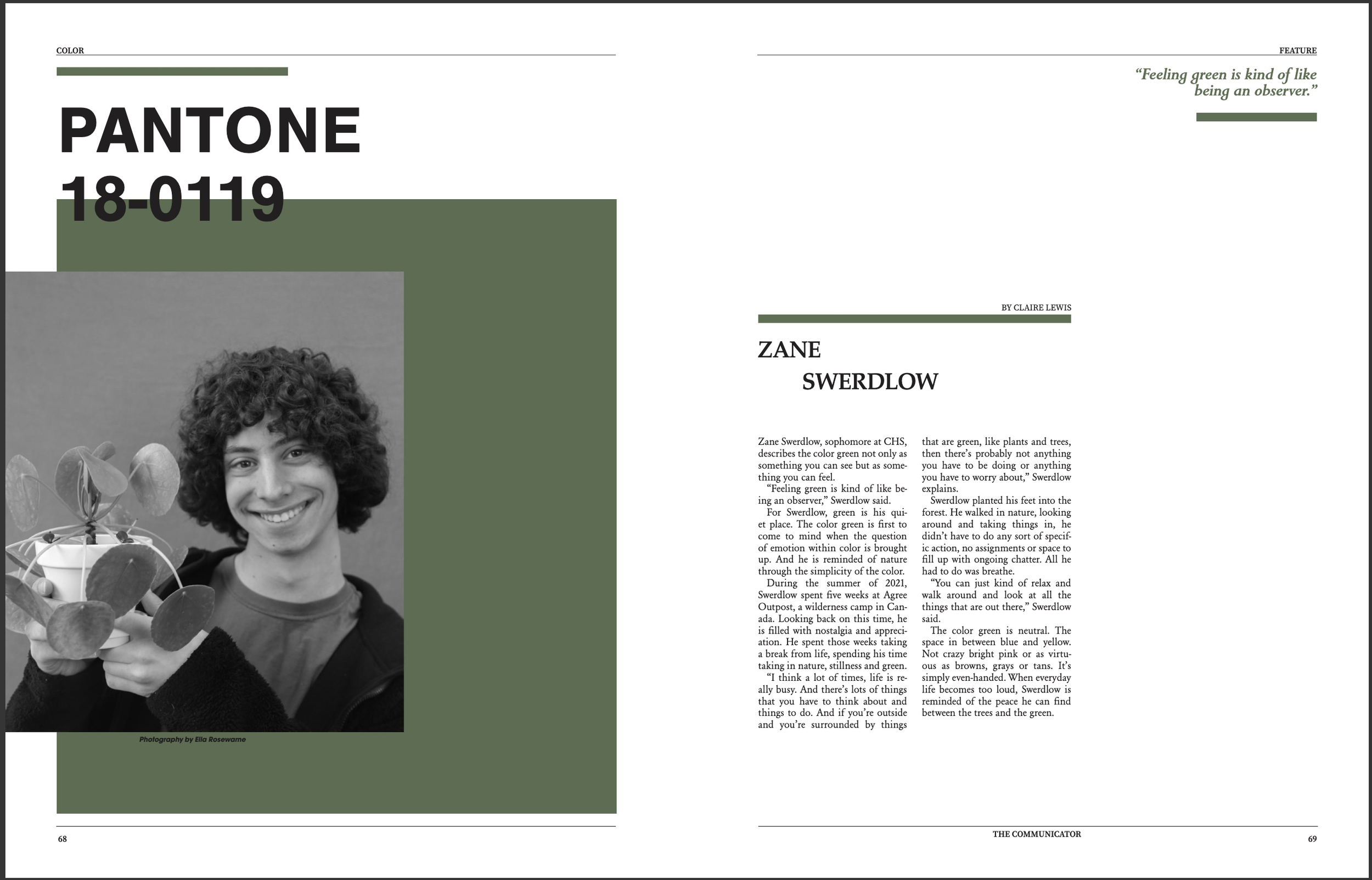
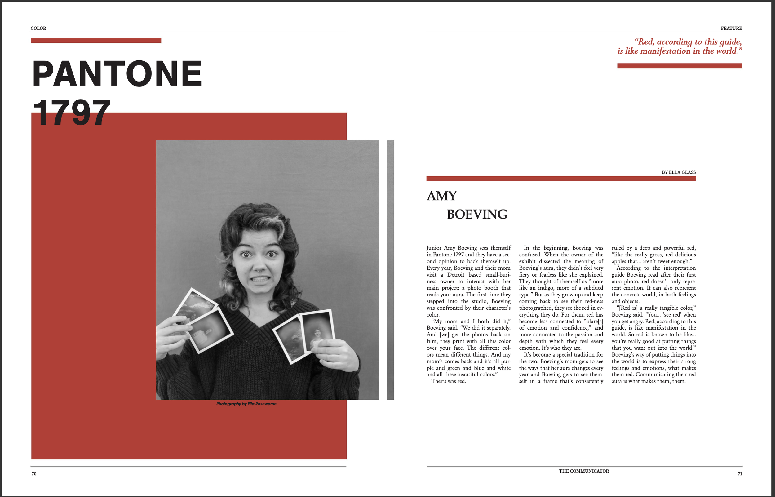
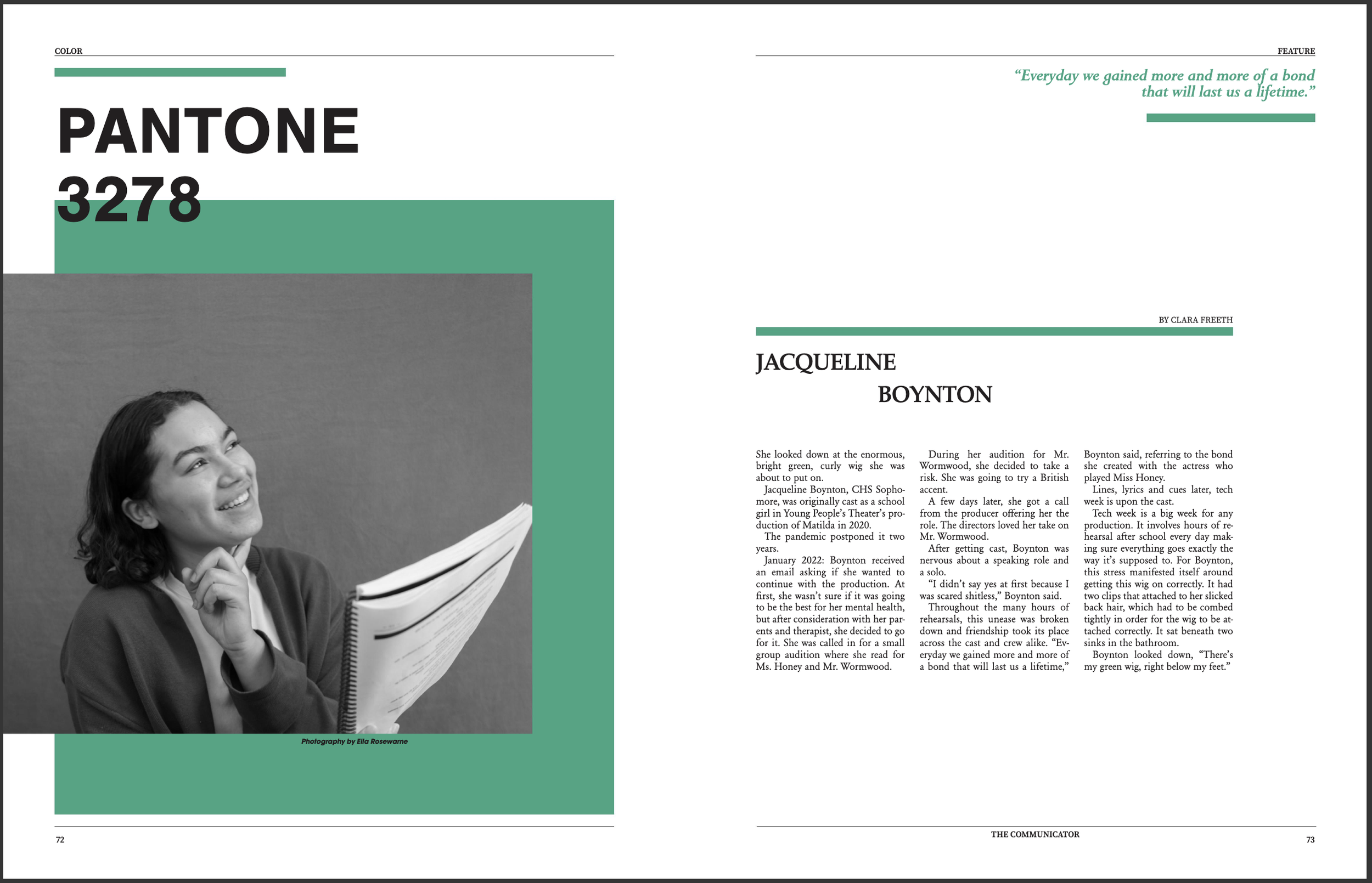
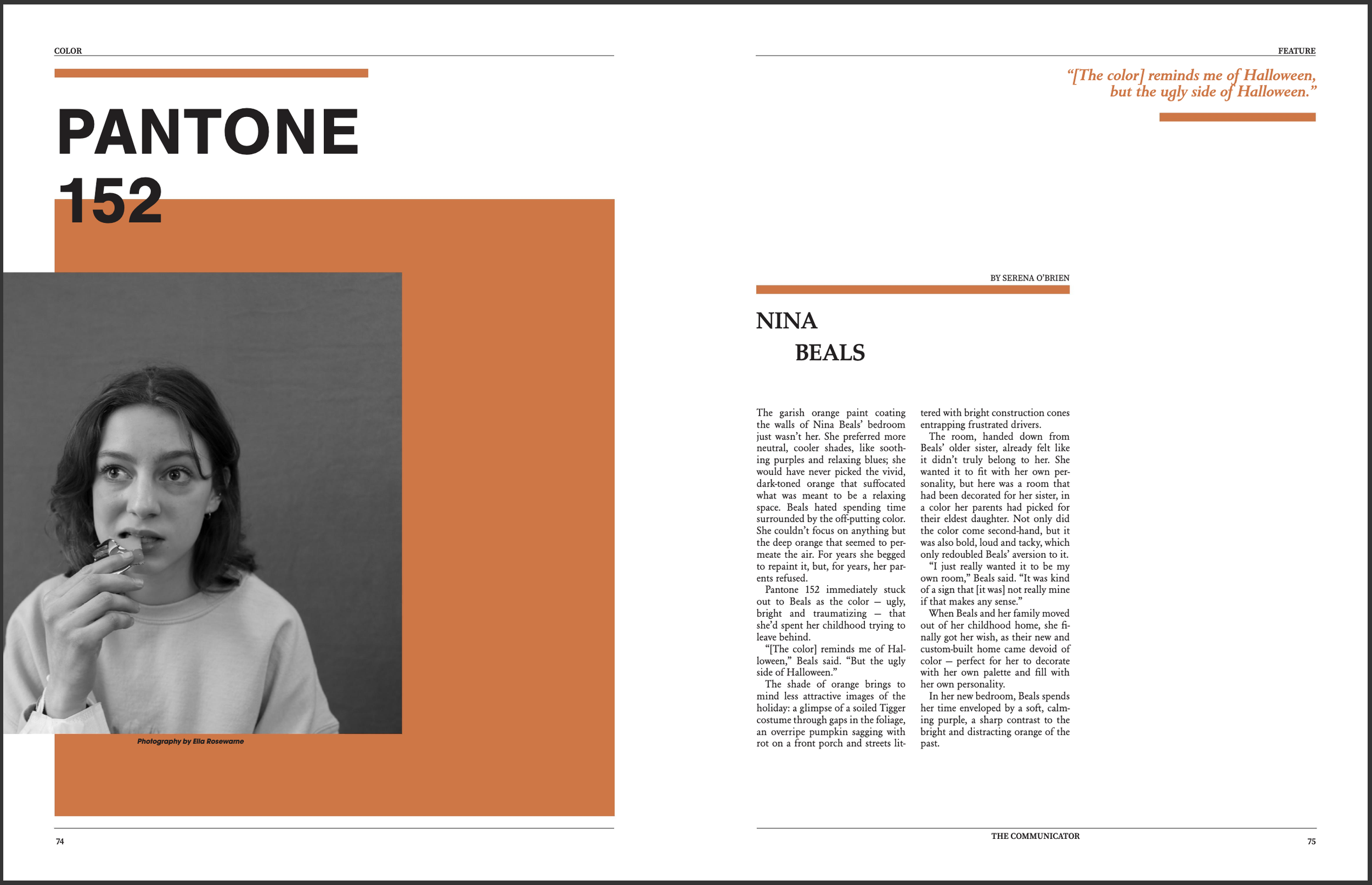
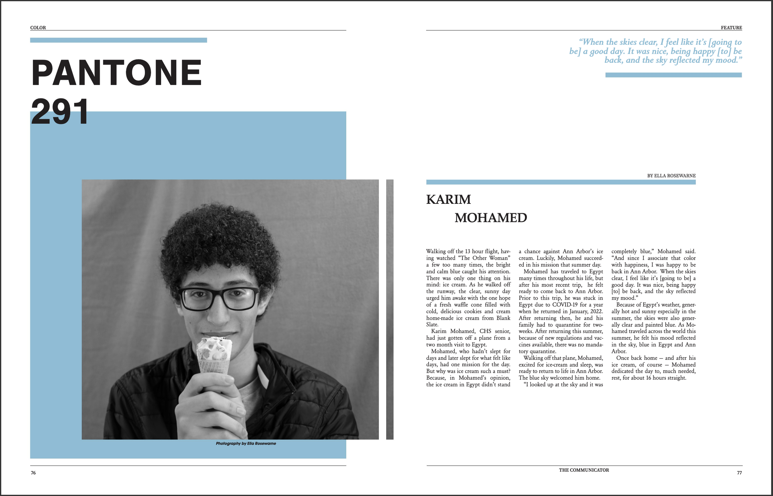
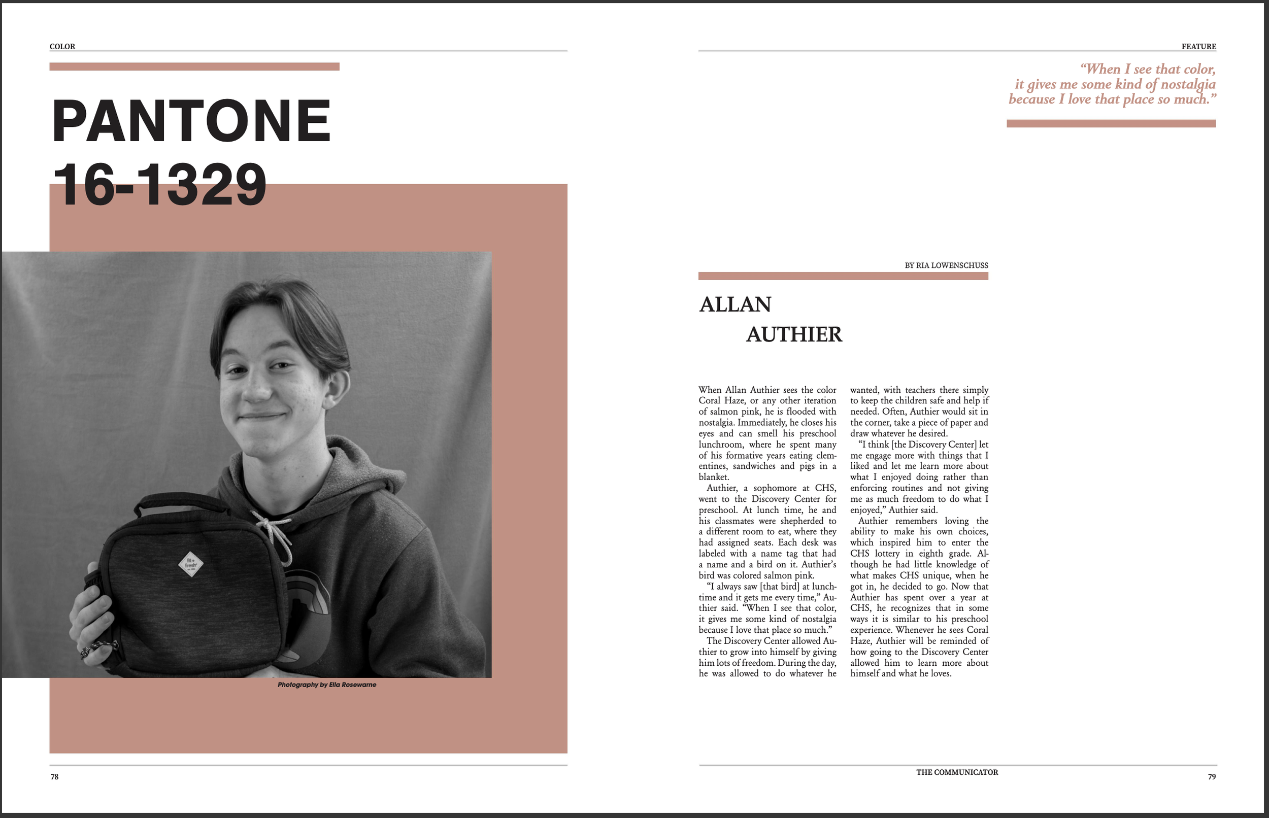
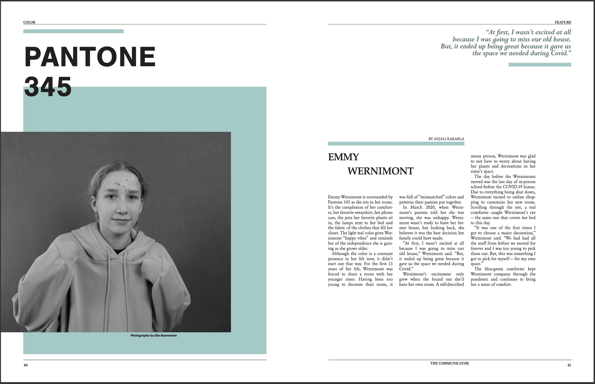
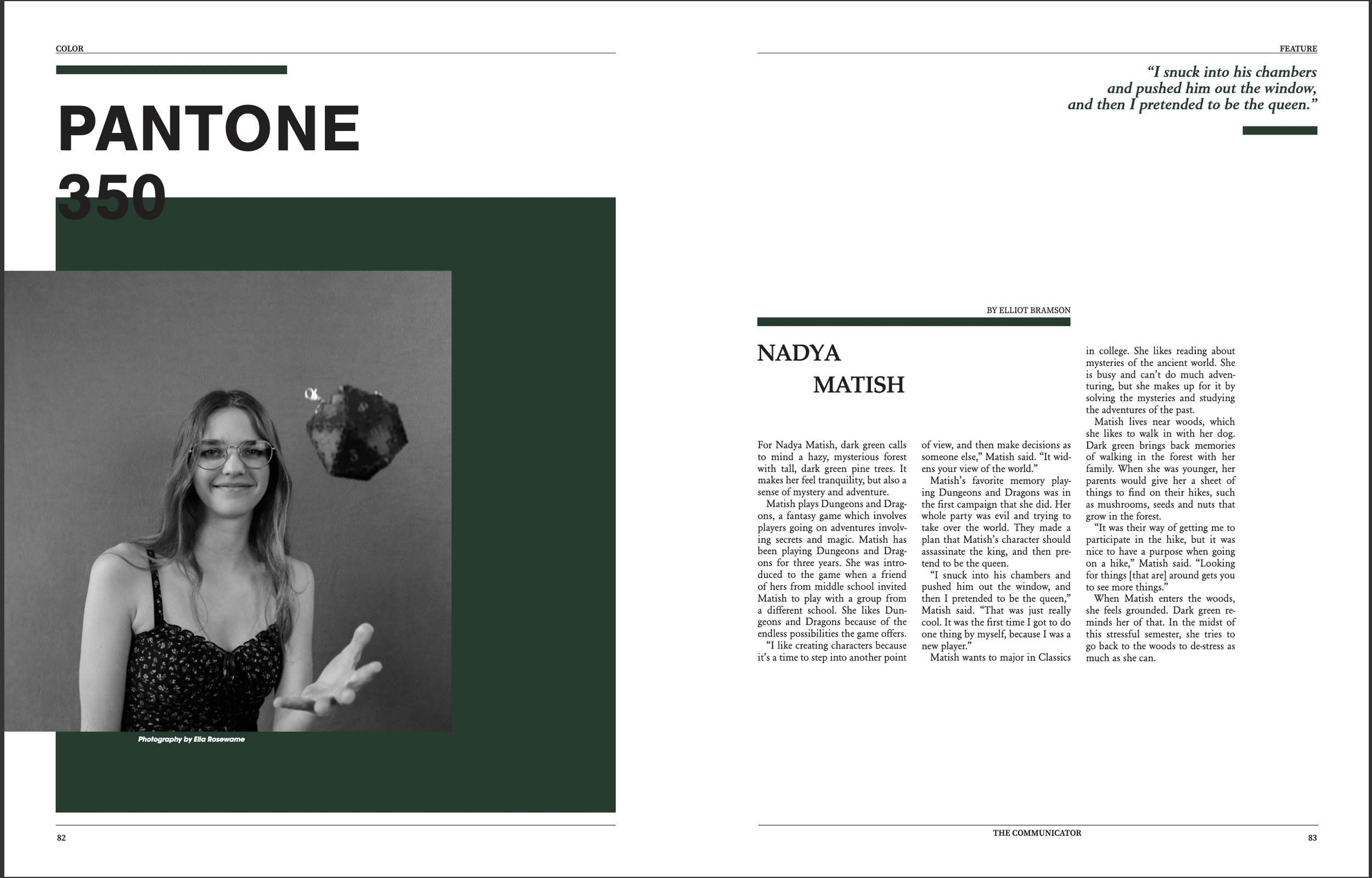
Edition 2, January 2023
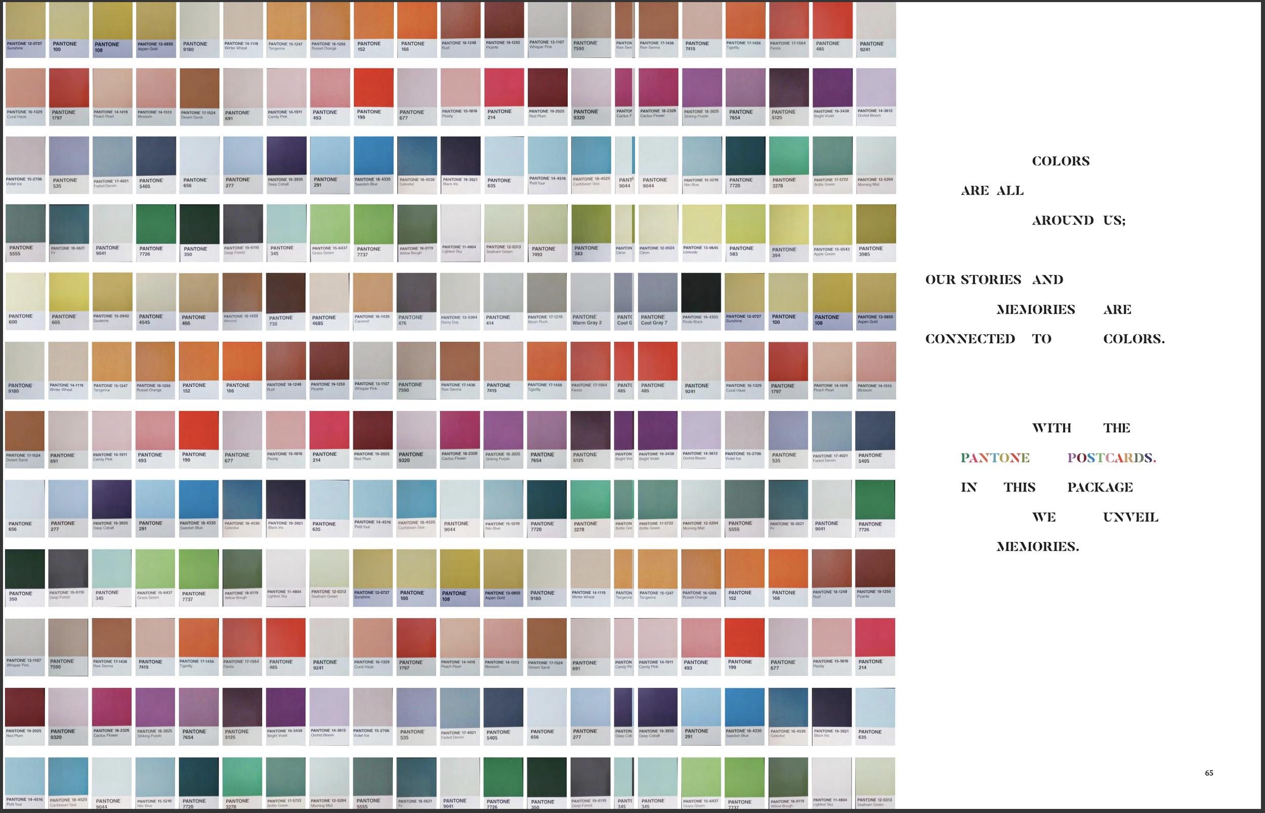
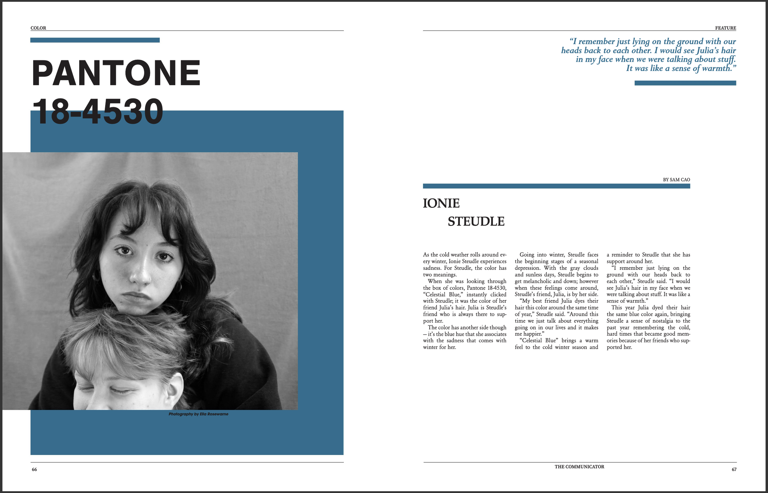
This was our Color Stories Package in the second edition this year. Each interview was prompted with a full set of Pantone cards where they picked one color, and they then described it and a memory they associated with that color. For the package’s cover page, I took individual pictures of each card, cropped the pictures and created a grid, in their original order, on Indesign. To counter the aligned, perfectly ordered cards, I scattered the writing and played with the colors. The color accompanying each story is the color each student chose along with the Pantone number.
Edition 2, January 2023
This story featured two students who met through school, but became friends through music. I wrote this story with one other staff member and photographed the event with two other staff members. While covering the event, I kept in mind the layout of a page and to have a wide range of photos: close-up portraits, fisheyes of the audience, the calm and exciting moments, performing and after performing and the audience’s reactions. While creating the page, I wanted to include a range of these. Creating a photo story layout, including room for my story, allowed me to create an efficient, understandable spread.
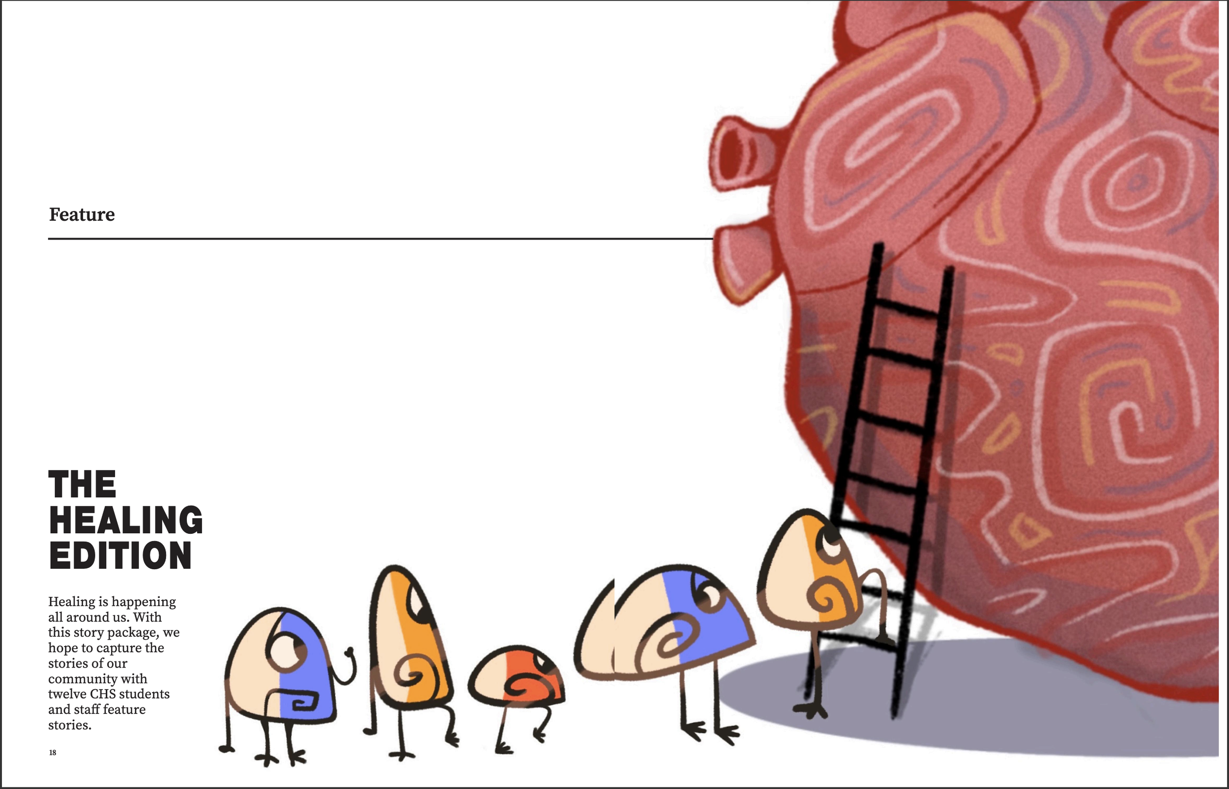
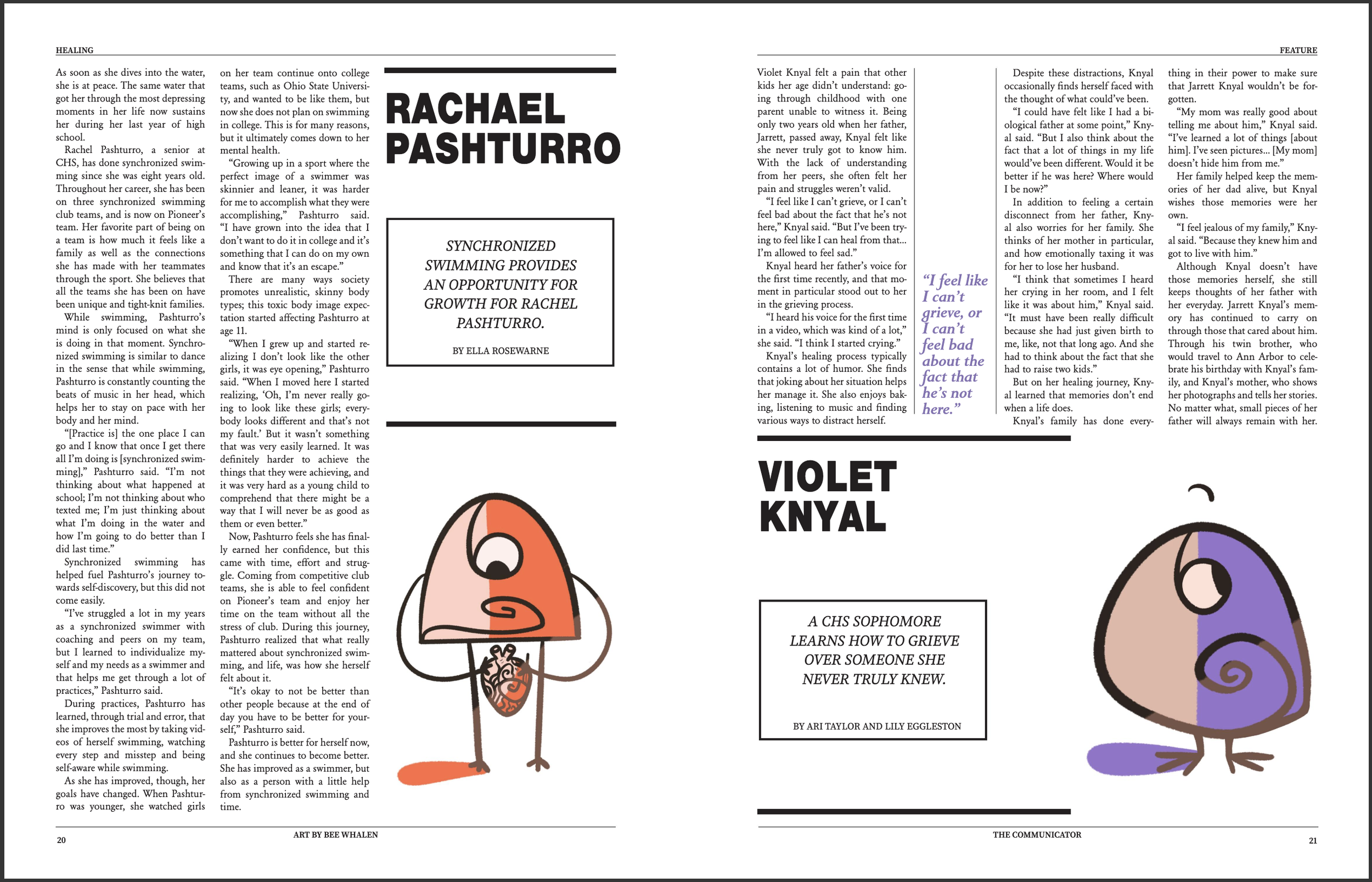
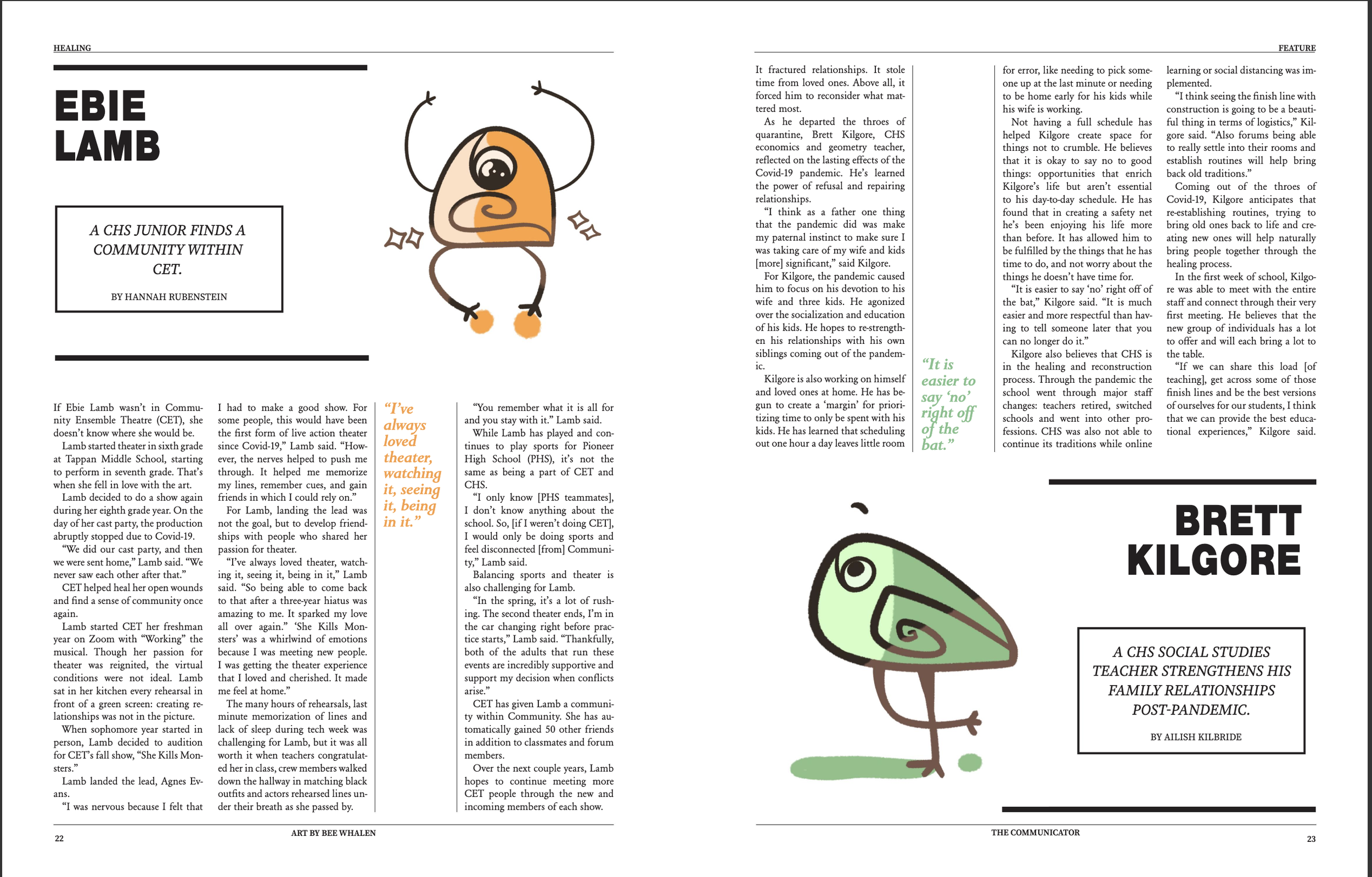
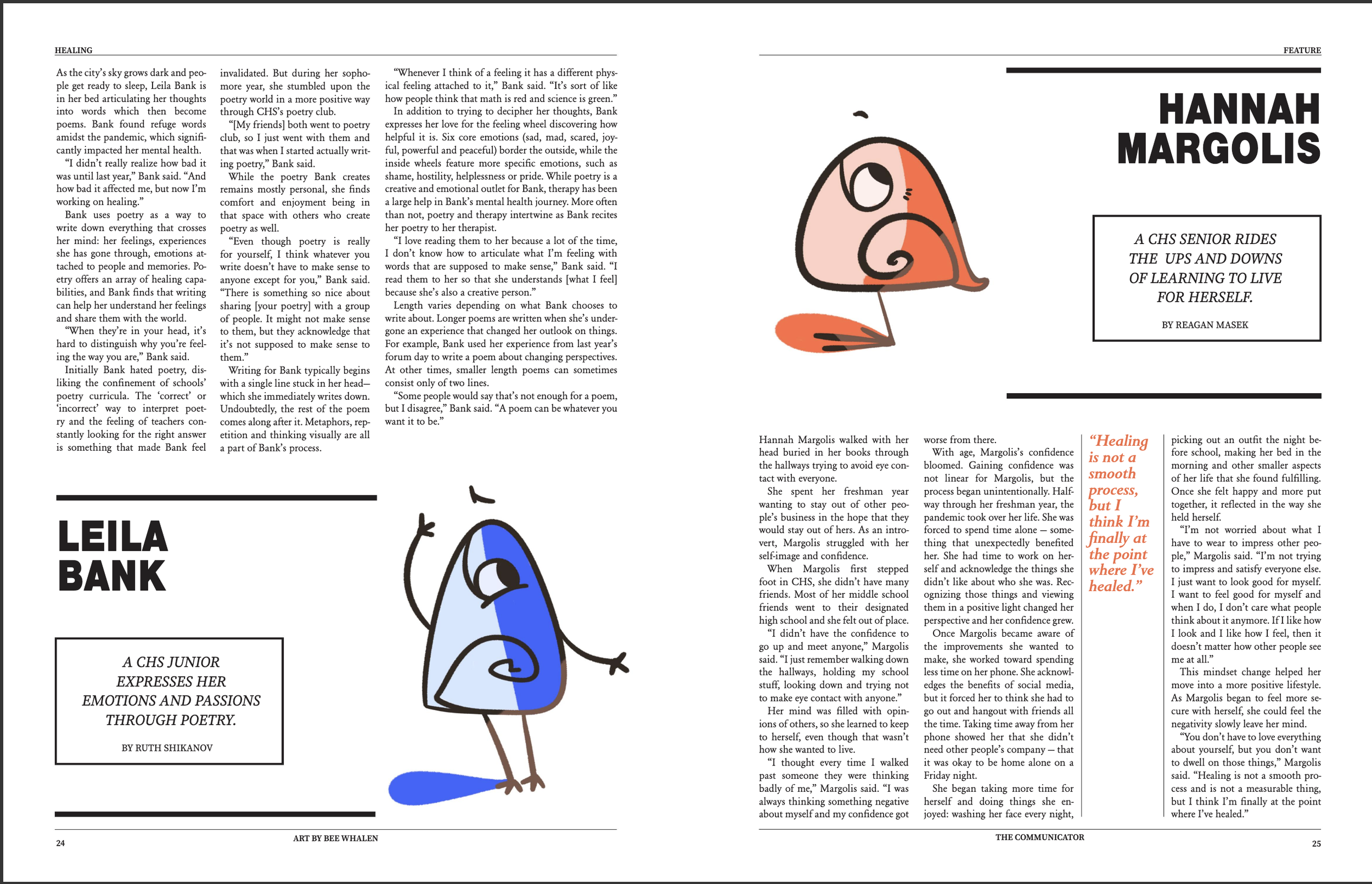
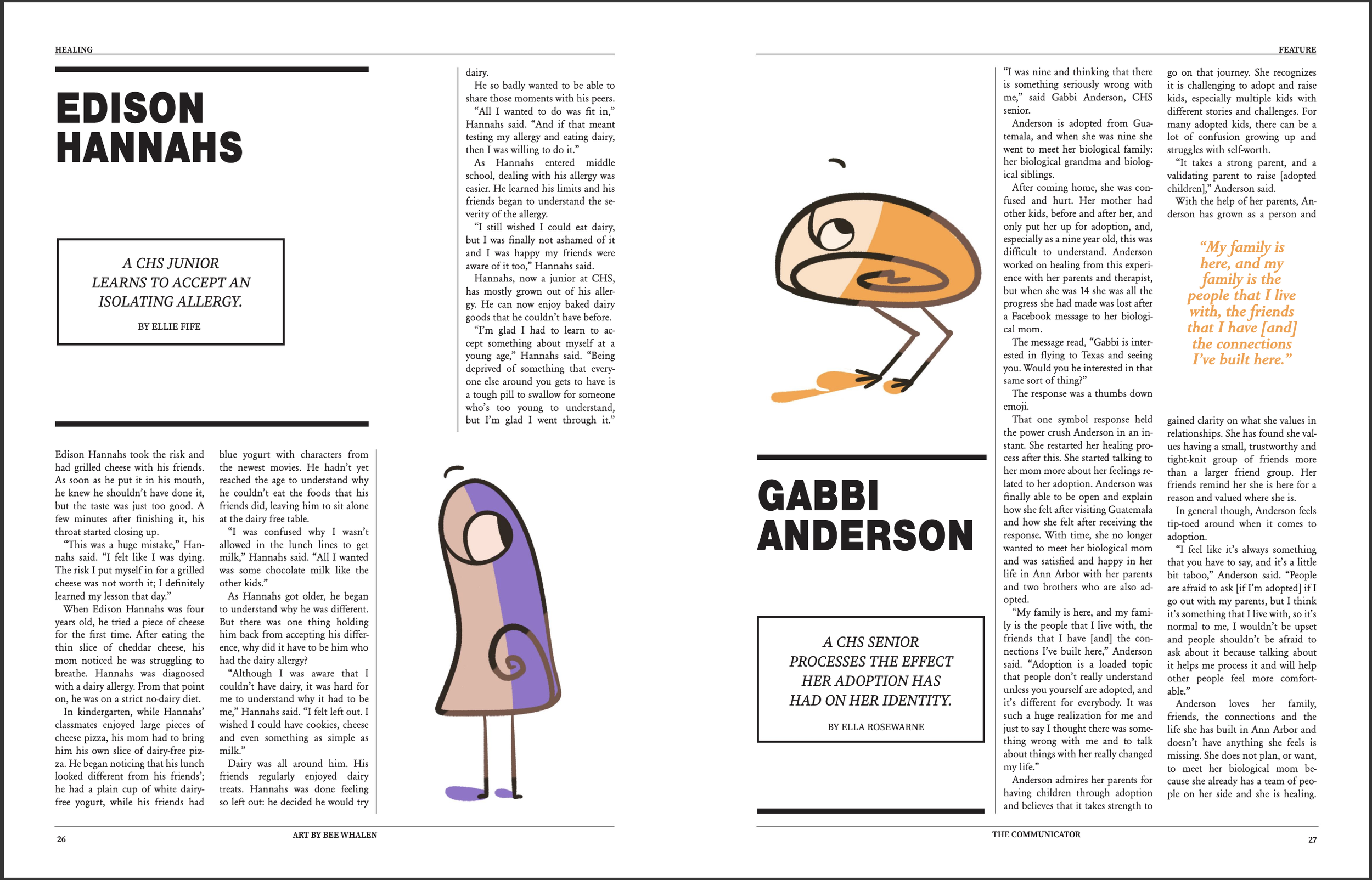
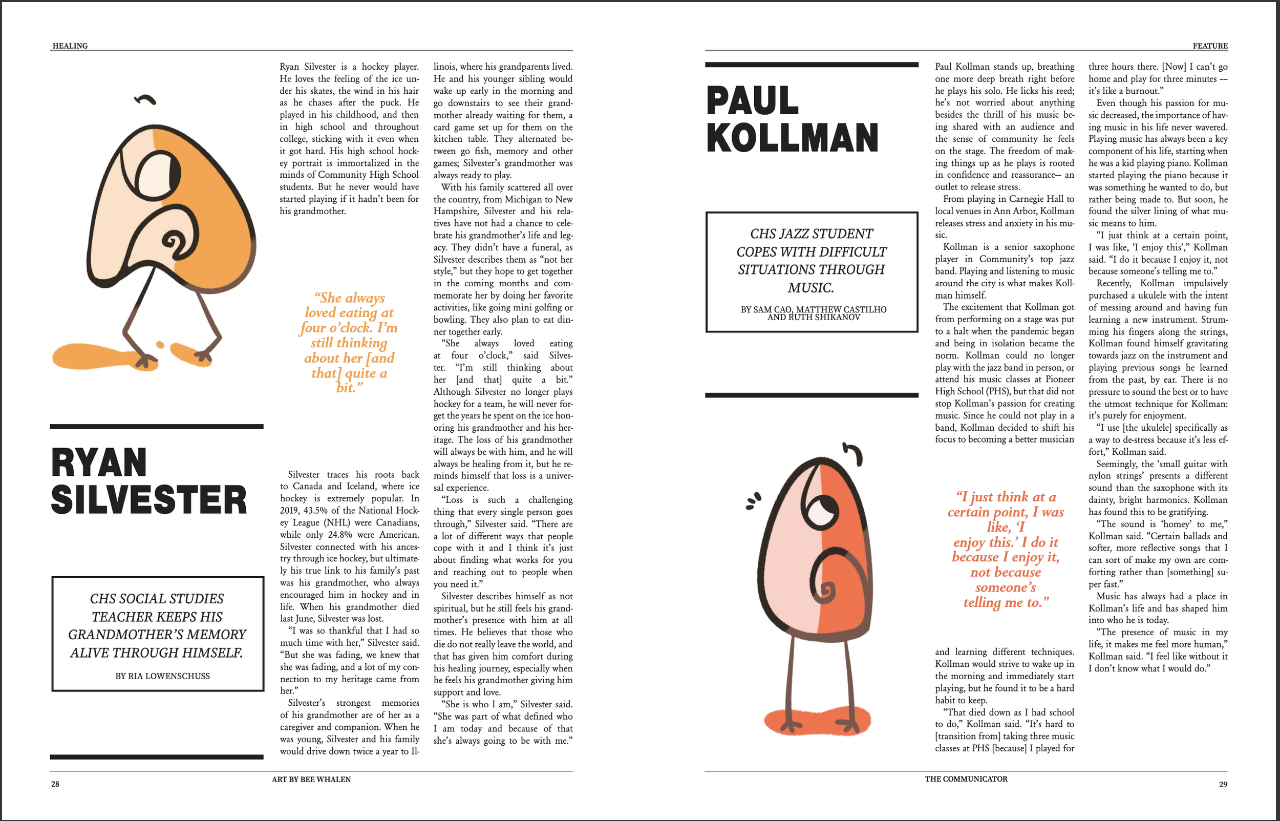
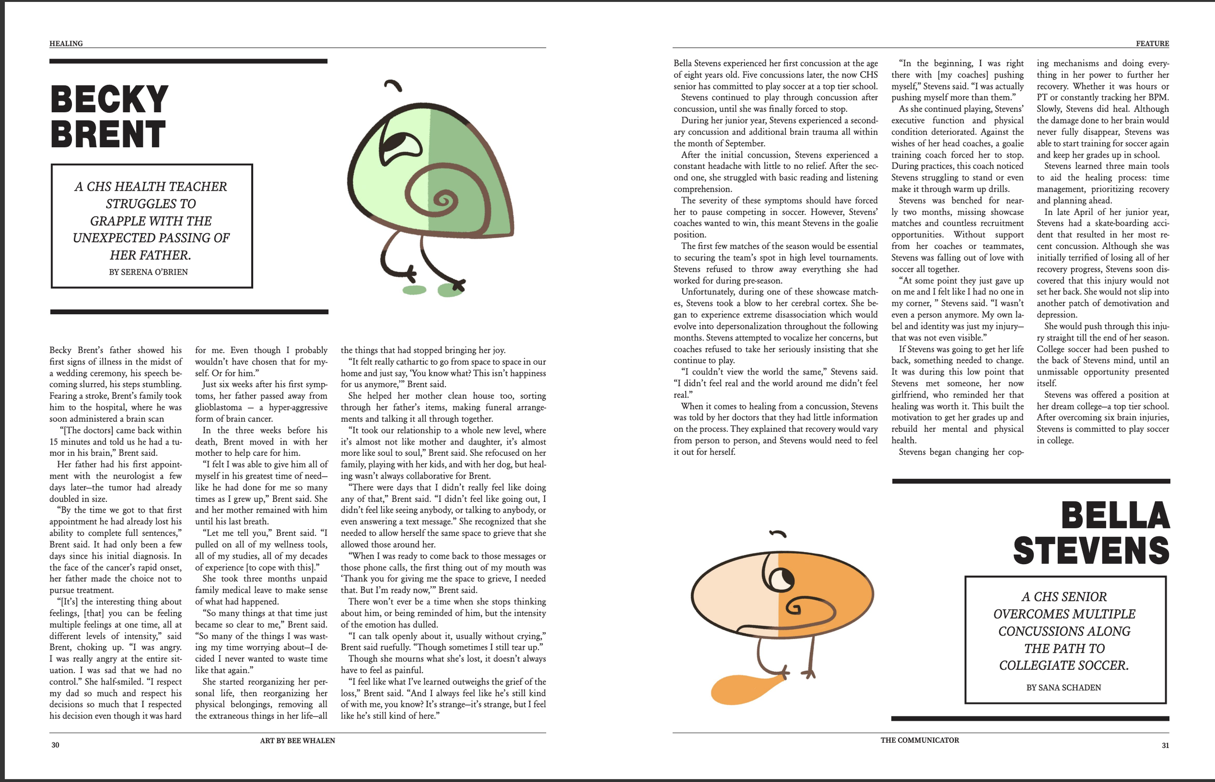
Edition 1, November 2022
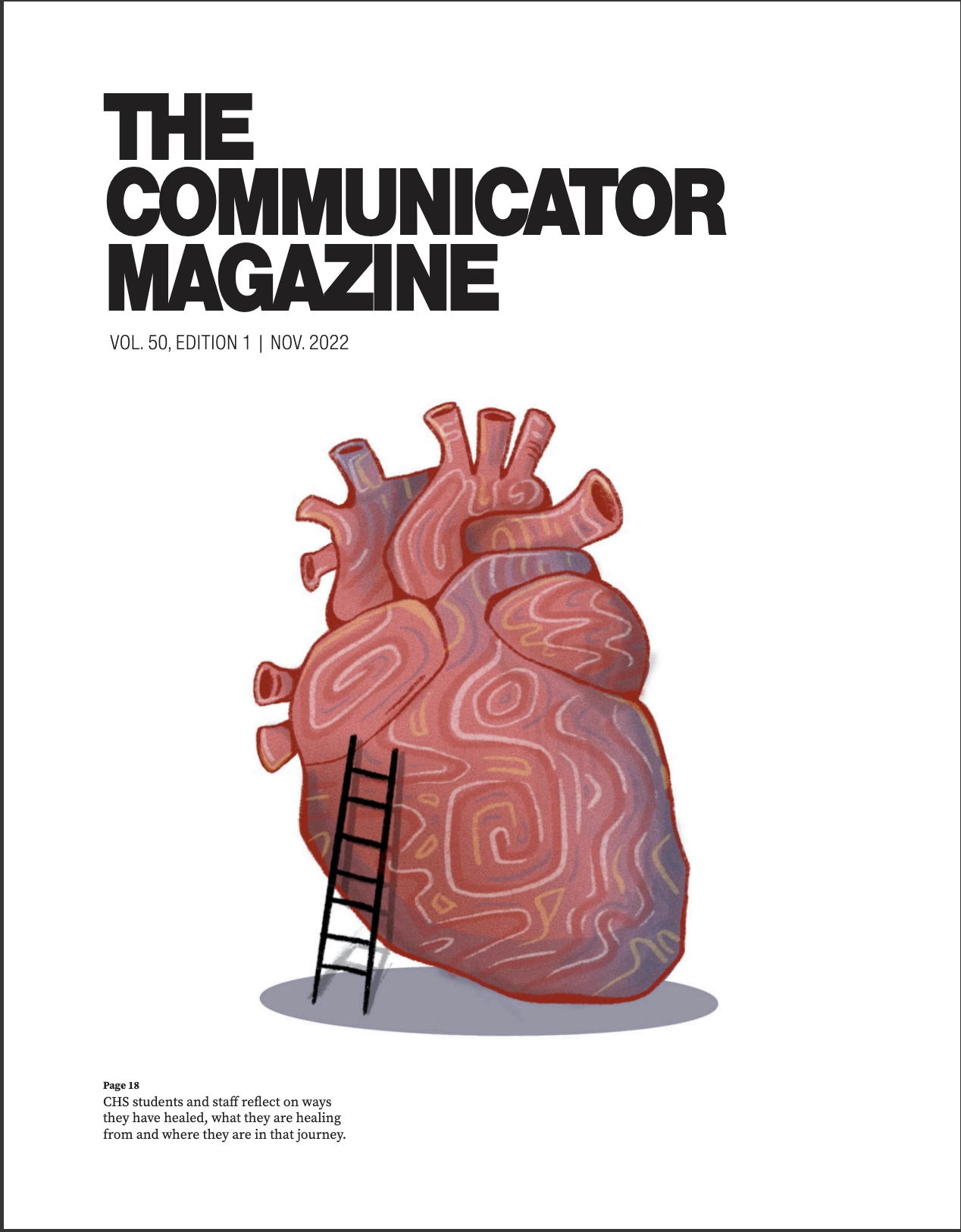
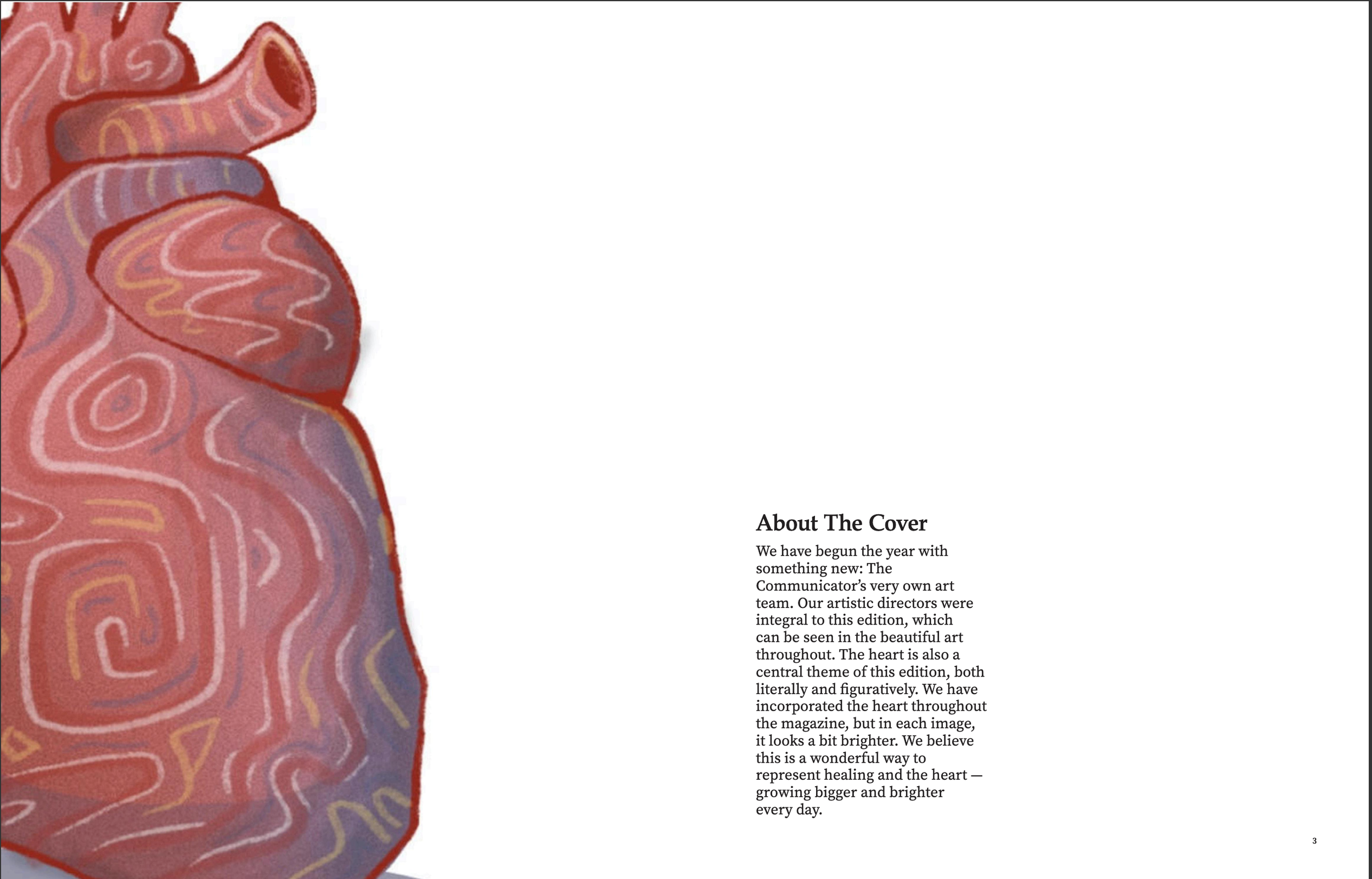
This story package was from our first edition this year. Working with the art team from start to finish, we planned an art story where the characters shown repair and heal the heart throughout divider pages in the magazine. In the story package, students reflect on their healing moments. The stories are all accompanied with a small character as well.
Edition 2, January 2023
Working with the writers of this story, they wanted a dramatic portrait to match the vibe of their story and set the scene. The subject, Hazel Derry, and I explored lighting and used a portable camera light in our schools theater, after shutting the heavy velvet curtains to cut out the light. The story is about conspiracy theory holes, which Derry found herself falling into.
Edition 2, January 2023
This is our second edition Table of Contents this year. It is based off a template I created this summer when preparing for the school year. I wanted the story package (far left) to stand out and for the other sections to be clear. I also wanted a clean look that gave space for both photography and art, which I feel this layout accomplished.
